Cath Carter | Brand Identity
Catherine approached me to help her redesign her ‘Cath Cater’ brand as her following and beauty product range offering had grown very quickly, and she needed a professional look that reflected the quality of her products and also matched her personality.
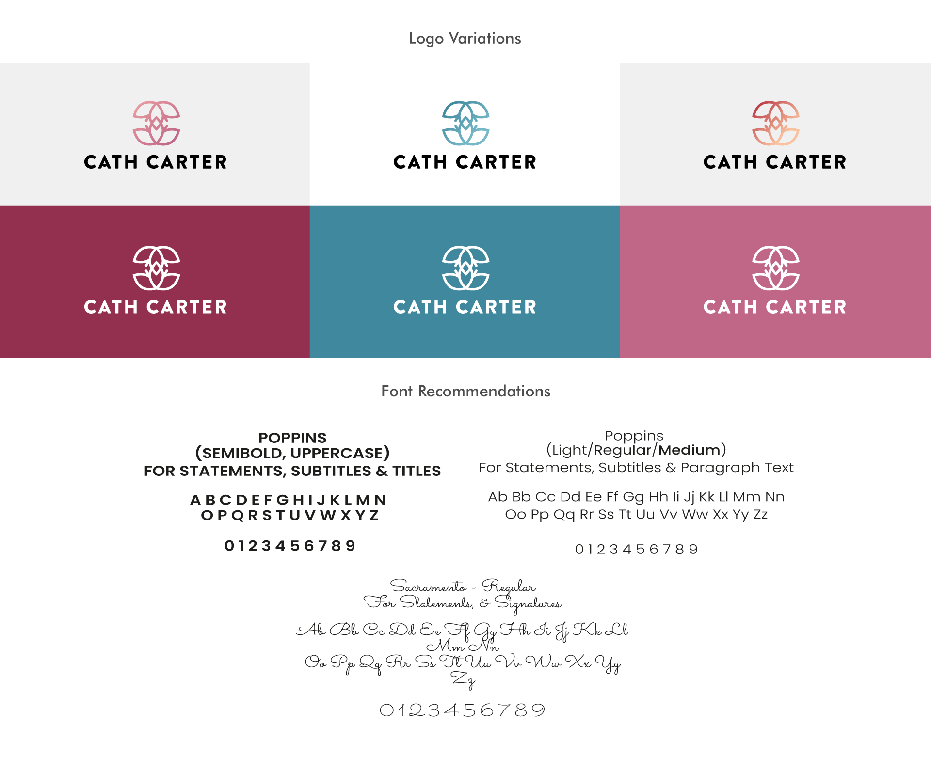
The Clematis flower has a significant meaning to her and so I wanted to try and bring this into the logo design and into elements of the brands patterns/textures. I created a simplified side on view of the Clematis flower which I then duplicated and flipped upside down, placing it slightly over the top of the tip of the first flower to create a ‘C’ and backwards ‘C’ shape to represent ‘Cath Carter’. Below are some alternative variations of the logo that can be used on pale and coloured backgrounds.
![Picture showing the Cath Carter logo design in pink on a pale background](https://usercontent.one/wp/www.samanthathorley.com/wp-content/uploads/2023/11/Thumbnail_640x480px_Cath_Carter_Brand_Identity-1.jpg?media=1697813262)
![Image shows the Cath Carter logo in different formats in different colours with the brand's fonts below](https://usercontent.one/wp/www.samanthathorley.com/wp-content/uploads/2023/11/Large_1920x1080px_Cath_Carter_Brand_Identity_Samantha_Thorley-2B.jpg?media=1697813262)
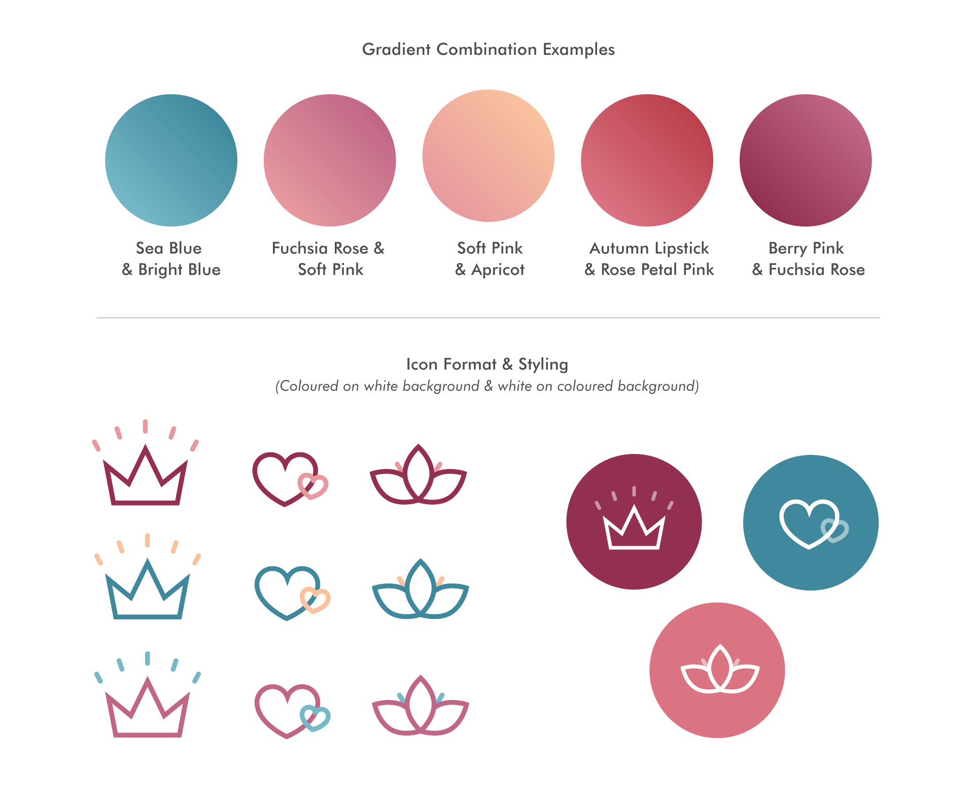
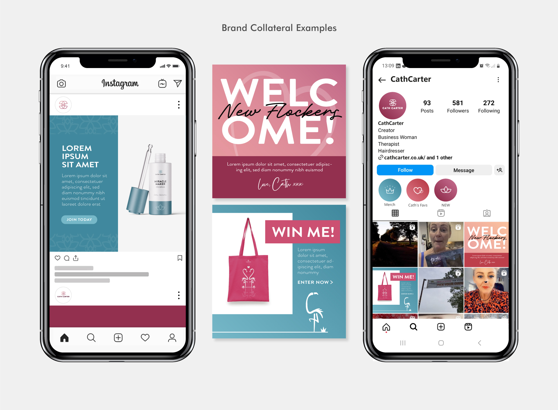
Below are some pattern designs created for the brand. I used the Clematis flower to create some simple structured flower designs, as well as love heart patterns to be used throughout various brand collateral such a gift boxes, social media post design, product packaging etc.
![Image showing a range of pattern designs for the Cath Carter brand](https://usercontent.one/wp/www.samanthathorley.com/wp-content/uploads/2023/11/Large_1920x1080px_Cath_Carter_Brand_Identity_Samantha_Thorley-3.jpg?media=1697813262)
![Image showing colour gradient combinations and icon designs for the Cath Carter Brand](https://usercontent.one/wp/www.samanthathorley.com/wp-content/uploads/2023/11/Large_1920x1080px_Cath_Carter_Brand_Identity_Samantha_Thorley-4.jpg?media=1697813262)
![Image showing two phones displaying the social media Instagram pages for the Cath Carter brand, with examples of designed posts](https://usercontent.one/wp/www.samanthathorley.com/wp-content/uploads/2023/11/Large_1920x1080px_Cath_Carter_Brand_Identity_Samantha_Thorley-5.jpg?media=1697813262)
![Image showing a mobile phone displaying the Facebook page of the Cath Carter Brand with brand collateral examples below with branded candles and a gift box design](https://usercontent.one/wp/www.samanthathorley.com/wp-content/uploads/2023/11/Large_1920x1080px_Cath_Carter_Brand_Identity_Samantha_Thorley-6.jpg?media=1697813262)
Cath required two logos for sub brands that sat within the Cath Carter brand; NBS and Flocking Fabulous. The logos needed to have their own look but be similarly styled to link to the CC brand.
![](https://usercontent.one/wp/www.samanthathorley.com/wp-content/uploads/2023/11/Large_1920x1080px_Cath_Carter_Brand_Identity_Samantha_Thorley-7.jpg?media=1697813262)
Need a brand identity creating for your business?
If you’re a new business looking to have your brand identity created, or you’re an established business needing a brand refresh – please feel free to drop me an email, I’d love to find out more about your project and help bring your branding to life!